When someone walks into a café, the first thing they notice isn’t always the coffee—it’s the feeling of the space. That feeling often comes from colors, even before they consciously realize it. The way colors are used can influence mood, behavior, and even how long customers choose to stay. This is where understanding color psychology mood for cafe design becomes incredibly valuable.
In today’s café culture, especially in design-focused cities, creating the right atmosphere is just as important as serving great coffee. A well-thought-out color palette can turn a simple café into a place people want to return to again and again.
Why Color Psychology Matters in Luxury Café Design
When customers step into a café, they immediately form an impression. Before they notice the menu or furniture, they feel the space—and that feeling is heavily influenced by color.
In Dubai’s luxury café scene, design is about creating a mood that aligns with the brand. This is where color psychology mood for cafe becomes essential. It allows you to shape emotions subtly, guiding how customers interact with the space.
A well-designed color palette can make a café feel calm, inviting, premium, or energetic—depending on the experience you want to offer.
More – When it comes to interiors and fit-outs in Dubai, the biggest challenge is not just finding a company to execute the work — it’s finding the right partner you can trust. At Interiofy®
How Colors Influence Customer Mood and Experience
Colors have a direct impact on how people behave. Warm shades tend to create energy and encourage social interaction, while cooler tones bring a sense of calm and comfort.
For example, a café designed with soft earthy tones may encourage customers to stay longer, while a space with bold accents may feel more dynamic and fast-paced. By applying color psychology mood for cafe, you’re designing not just a space, but an experience.
In Dubai, where customers often look for aesthetically pleasing environments, these subtle details make a big difference.
Luxury Color Palettes Trending in Dubai Cafés
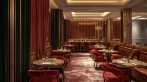
Luxury in Dubai is often expressed through understated elegance rather than loud design. The color palettes used in high-end cafés reflect this approach.
- Soft neutrals like beige, ivory, and sand create a calm and sophisticated base
- Deep green and olive tones add richness while maintaining a relaxed atmosphere
- Black with gold accents gives a bold yet refined luxury touch
- Warm wood tones and browns bring depth and natural warmth
- Muted metallics like brass and champagne gold enhance the premium feel
These combinations work beautifully when applying color psychology mood for cafe, as they create an environment that feels both exclusive and comfortable.
Best Color Psychology Mood Strategies for Café Interior Design
Choosing colors is not just about preference—it’s about purpose. The right strategy ensures that your café delivers the experience your customers expect.
Warm Tones for a Welcoming Atmosphere
Warm colors like terracotta, caramel, and muted orange can make a café feel inviting and social. These tones are perfect for cafés where interaction and energy are important.
Cool Shades for Relaxation and Comfort
Soft blues, sage greens, and dusty teal tones create a peaceful environment. These are ideal for cafés where customers spend more time working or unwinding.
Neutral Base for a Luxury Look
Neutral colors act as a foundation in most luxury cafés. Shades like cream, taupe, and light grey keep the design clean while allowing other elements to stand out.
Using color psychology mood for cafe with a neutral base ensures flexibility and timeless appeal.
Accent Colors for Visual Interest
Accent colors add personality to the space. Whether through artwork, furniture, or feature walls, they create focal points that make the café memorable.
Designing According to Your Café Concept
Every café has its own identity, and color should reflect that. A high-end café in Dubai will require a very different palette compared to a casual coffee spot.
Luxury cafés often lean toward muted tones, layered textures, and elegant contrasts. The goal is to create a space that feels premium without being overwhelming.
By applying color psychology mood for cafe, you can ensure that your design aligns perfectly with your brand and target audience.
If you’re looking to create a refined and well-balanced interior, working with professionals can make the process smoother. Platforms like Interiofy specialize in designing spaces that combine luxury with functionality.
Common Mistakes to Avoid in Café Color Design
Even with the best intentions, it’s easy to make mistakes when choosing colors.
One of the most common issues is overusing bold colors, which can make the space feel cluttered. Another mistake is ignoring how lighting affects color, leading to unexpected results.
Following trends without understanding your brand can also weaken the overall design. Applying color psychology mood for cafe correctly means making thoughtful choices rather than copying what’s popular.
The Role of Lighting in Color Perception
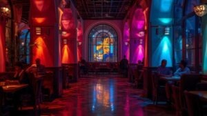
Lighting plays a huge role in how colors appear. Natural light enhances soft tones, while artificial lighting can completely change how a color looks.
Warm lighting can make a space feel cozy and inviting, while cooler lighting creates a more modern and clean atmosphere. The key is to find a balance that complements your color palette.
In luxury café interiors, lighting and color always work together to create the desired color psychology mood for cafe effect.
Creating a Balanced and Cohesive Color Scheme
A successful café interior is built on harmony. Instead of using too many colors, focus on creating a balanced palette.
Start with a base color, add complementary shades, and then introduce accents for depth. This layered approach keeps the design visually interesting without feeling overwhelming.
Using color psychology mood for cafe in this way ensures that your space feels cohesive and well thought out.
Strengthening Brand Identity Through Color
Color is one of the strongest elements of branding. It helps customers recognize and remember your café.
From walls to menus and packaging, consistent use of color creates a clear identity. In Dubai’s competitive café market, this consistency can set you apart.
A carefully planned color psychology mood for cafe strategy ensures that every element of your space works together to tell your brand story.
For a more tailored and professional approach, you can explore services offered by Interiofy to bring your vision into reality.
Conclusion
In Dubai’s luxury café scene, design is about more than just appearance—it’s about creating an experience that people remember. Color plays a central role in shaping that experience.
By understanding and applying color psychology mood for cafe, you can design a space that feels welcoming, elegant, and perfectly aligned with your brand. From soft neutrals to rich accent tones, every choice contributes to the overall atmosphere.
When done right, color doesn’t just decorate a café—it defines it. And in a city where every detail matters, that difference can turn your café into a destination.